
Learn why contrast—not simply detail—is the foundation of realistic Black & Grey tattoos and one of the key elements that separates an average tattoo from a timeless masterpiece.
When people think about realistic tattoos, the first thing that usually comes to mind is detail.
Tiny textures, lifelike portraits and incredibly smooth shading often become the main focus when admiring a Black & Grey tattoo. While these elements are certainly important, they are not what truly determines the quality of a piece.
Behind every great realistic tattoo lies something much more fundamental: contrast.
Contrast is what creates depth, guides the eye through the composition and gives the illusion of three-dimensionality. It allows the subject to stand out, makes every element easier to read and helps the tattoo maintain its visual strength long after it has healed.
Without it, even the most detailed design can appear flat, confusing or lose impact over time.
As a Black & Grey realism artist, I don’t simply recreate photographs. Every project is carefully designed by balancing light, shadow and negative space to produce a tattoo that not only looks realistic on the day it’s finished but continues to age beautifully for years to come.
Understanding why contrast matters will help you appreciate realistic tattooing from a completely different perspective—and make better decisions when planning your next piece.
When tattoo artists talk about contrast, they aren’t referring to making a tattoo darker.
Contrast is the relationship between the deepest blacks, the soft grey transitions and the untouched skin that acts as natural highlights. Together, these values create balance, depth and visual hierarchy within the composition.
Think of a black and white photograph.
Without strong differences between light and shadow, every element blends together and the image feels flat. The same principle applies to tattooing.
In Black & Grey Realism, contrast is what separates a face from its background, gives volume to an animal’s fur, defines the folds of fabric or makes architectural details appear almost sculptural.
Good contrast allows the eye to understand the image immediately, whether you’re looking at it from a few centimetres away or from across the room.
This is one of the biggest differences between simply copying a reference image and creating a tattoo specifically designed to work on human skin.
Every person has different anatomy, skin tone and movement. Because of that, the artist must adapt the distribution of light and shadow rather than reproduce every detail exactly as it appears in a photograph.
The result is a composition that feels balanced, natural and visually powerful—both today and many years from now.
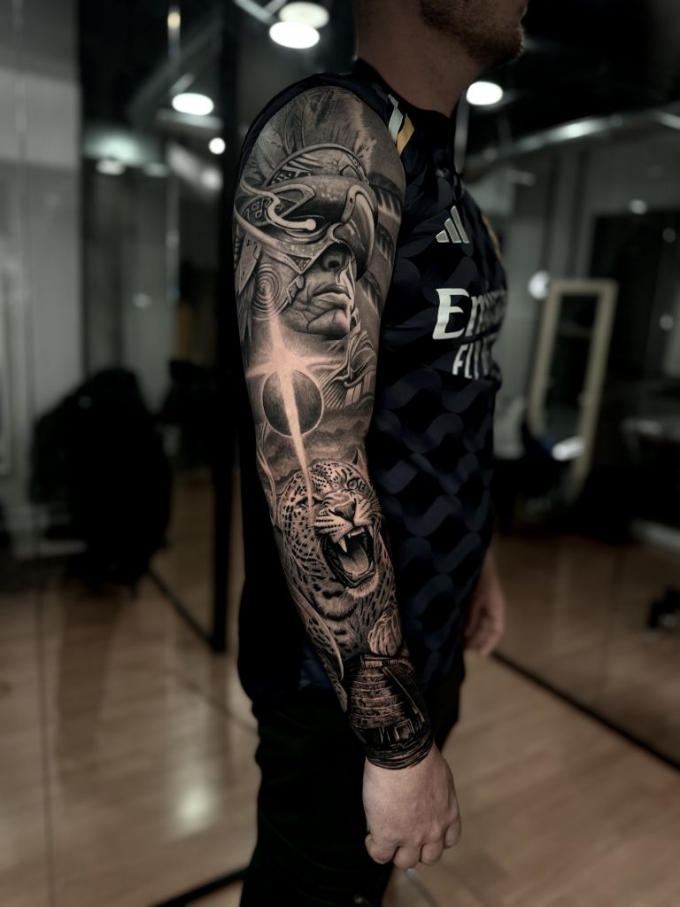
One of the most common misconceptions about realistic tattooing is that the more detail a tattoo contains, the better it will look.
At first glance, this idea seems logical. Highly detailed tattoos often appear more impressive in close-up photographs, especially on social media where images are enlarged and heavily lit. However, tattooing is very different from digital photography.
A tattoo isn’t viewed only from a few centimetres away.
It needs to remain clear from different distances, adapt to the natural curves of the body and continue looking balanced after years of healing and ageing.
This is where many tattoos fail.
When every square centimetre contains the same amount of texture, the eye no longer knows where to focus. Hair, skin, clothing, backgrounds and decorative elements begin competing for attention until the entire composition feels visually overwhelming.
Great Black & Grey realism is not about adding more information.
It’s about deciding what deserves the viewer’s attention.
An experienced artist intentionally creates areas with stronger detail and others with softer transitions. This visual hierarchy naturally guides the eye towards the most important parts of the design, making the tattoo easier to understand and far more impactful.
Sometimes, removing unnecessary details actually makes a tattoo look more realistic.
By simplifying secondary elements, the main subject gains strength, depth and presence. Portraits become more expressive, animals feel more alive and symbolic compositions communicate their message more clearly.
The goal has never been to reproduce every pixel of a reference photograph.
The goal is to translate that image into a composition that works beautifully on skin.
This is why professional realism artists spend as much time deciding what to leave out as they do deciding what to include. The balance between detail and simplicity is what ultimately creates tattoos that remain elegant, readable and timeless.
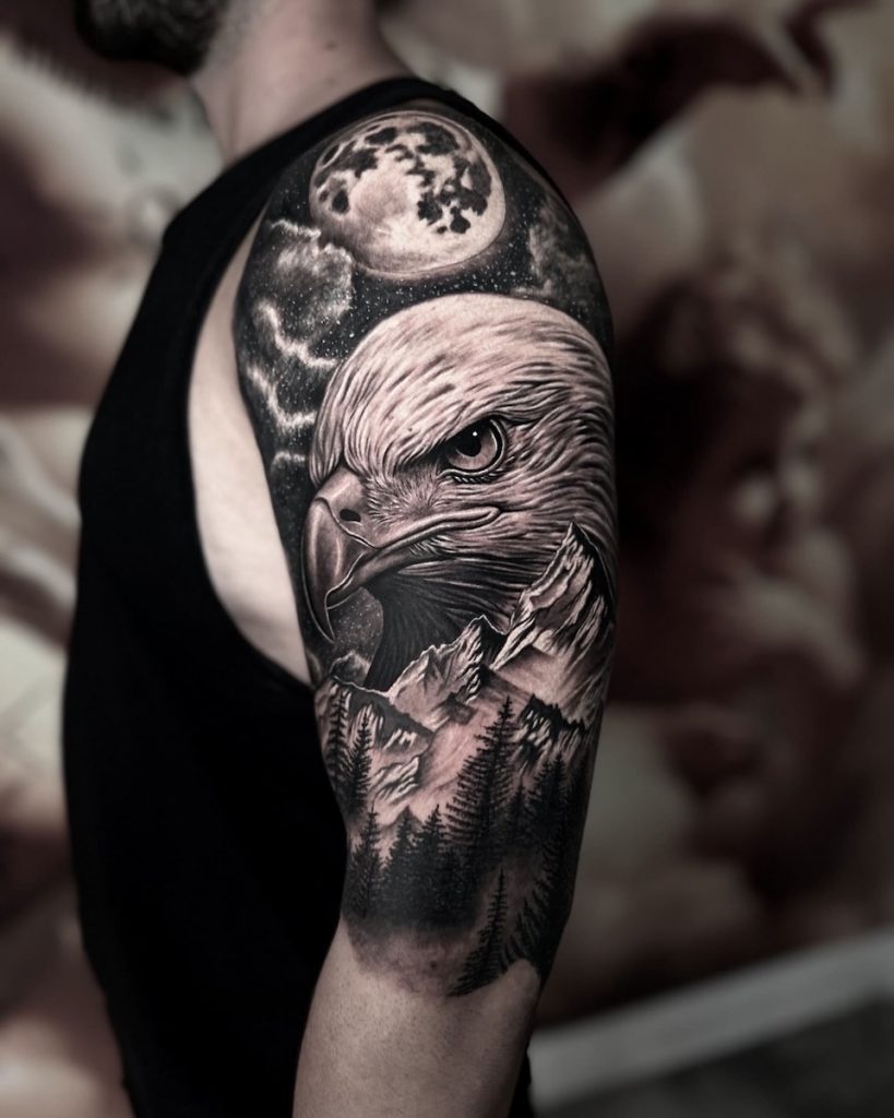
Every tattoo changes over time.
As the skin naturally regenerates, ink particles settle and extremely fine details begin to soften. This process is completely normal and happens with every tattoo, regardless of the artist or technique.
The difference is how well the original design was planned.
A tattoo built around strong contrast tends to age much more gracefully because its visual structure remains intact even as subtle textures evolve.
Deep blacks continue defining the composition.
Negative space keeps different elements separated.
Soft gradients preserve the illusion of depth.
Together, these elements allow the eye to recognise the subject instantly, even many years after the tattoo has healed.
By contrast, tattoos that rely almost entirely on tiny details and similar grey values can gradually lose clarity. As neighbouring tones become closer over time, different areas may begin to merge, making the composition appear flatter than it originally did.
This is why experienced Black & Grey artists don’t design tattoos only for the day they’re finished.
They design them for the years that follow.
Every shadow, highlight and transition is carefully considered so the piece continues to feel balanced as it naturally matures.
Creating a tattoo that ages beautifully is not about making it darker.
It’s about building a solid visual foundation from the very beginning.
When contrast is planned correctly, the tattoo maintains its character, depth and readability for many years, allowing the artwork to continue telling its story long after the final session has healed.
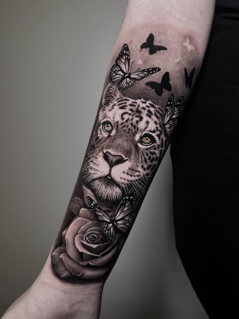
Strong contrast doesn’t happen by accident.
Long before the tattoo machine touches the skin, an experienced artist is already thinking about how light, shadow and composition will work together. Every decision—from the placement of the subject to the darkest areas of the design—is made with a clear purpose.
The creative process begins by identifying the focal point.
Every successful tattoo has one. It could be a portrait, an animal’s eyes, a religious figure or a symbolic element that immediately captures attention. Once that focal point is established, the rest of the composition is designed to support it rather than compete with it.
Deep blacks are then positioned strategically to create visual weight and anchor the composition. Around them, smooth grey transitions soften the image and add volume, while untouched skin provides natural highlights that make the tattoo breathe.
This careful balance creates rhythm throughout the design.
Rather than filling every available space with ink, professional artists understand the importance of restraint. Empty areas are just as valuable as tattooed ones because they separate different elements, improve readability and give the eye space to rest.
This approach is one of the defining characteristics of high-quality Black & Grey Realism.
Instead of copying a photograph exactly as it appears, the image is interpreted and adapted to work on living skin. Every decision is made to ensure the tattoo looks powerful from every angle, complements the body’s natural anatomy and remains visually balanced for years to come.
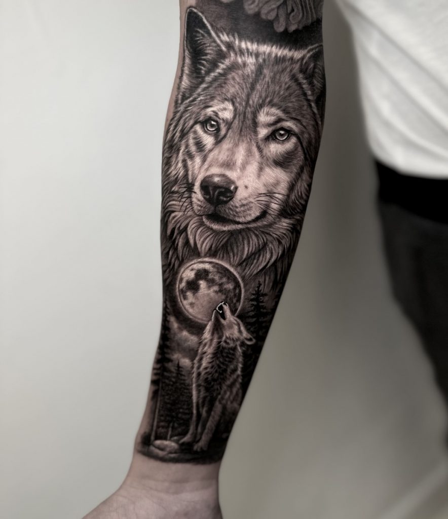
No two bodies are the same.
A design that looks perfect on paper may not work once it’s transferred to an arm, chest or back. Muscles move, skin stretches and every part of the body has its own natural flow.
For this reason, realistic tattooing should never begin with simply choosing a picture.
It should begin with understanding the person who will wear it.
The size of the tattoo, its placement and the body’s anatomy all influence how the final piece will be perceived. A portrait that is too small may lose expression over time, while a composition that ignores the body’s natural lines can feel disconnected instead of harmonious.
Designing specifically for the body allows the artwork to become part of the person rather than something placed on top of the skin.
The composition follows natural movement, highlights the anatomy and creates a more organic result. From every angle, the tattoo feels intentional, balanced and alive.
This personalised approach is what transforms an attractive image into a true custom artwork.
Rather than reproducing an existing design, every project becomes a collaboration between artist and client, combining technical realism with personal meaning and thoughtful composition.
A timeless Black & Grey tattoo isn’t defined only by exceptional technique.
It’s defined by how naturally it belongs to the person wearing it.
A truly memorable Black & Grey tattoo is about much more than technical precision.
It’s about creating a piece that reflects your story, fits your anatomy and continues to look powerful for years to come. Every decision—from composition and contrast to placement and shading—plays an important role in achieving a timeless result.
My approach is always personal.
Rather than reproducing an existing image, I work closely with every client to transform their ideas into a custom piece of art designed exclusively for them. The goal is to create a tattoo that feels unique, balanced and meaningful from every perspective.
If you’re considering a realistic Black & Grey tattoo and want a design created specifically for you, I’d be happy to help bring your vision to life.
Book your consultation today and let’s create something you’ll be proud to wear for a lifetime.
Contrast creates depth, separates different elements of the composition and helps the tattoo remain readable over time. Without strong contrast, even highly detailed tattoos can appear flat or lose impact as they age.
Not necessarily. A successful realistic tattoo depends on balance rather than the amount of detail. Professional artists know where to simplify, where to emphasise certain areas and how to create a clear focal point.
All tattoos naturally soften as they heal and age. However, a well-designed tattoo with strong contrast and thoughtful composition will preserve its clarity and visual impact much better over the years.
Reference images are the starting point, but they almost always need to be adapted. A professional artist redesigns the composition so it works with your anatomy, the placement and the long-term behaviour of the ink in the skin.
Look beyond close-up photographs. A strong portfolio will show tattoos that remain clear from a distance, have obvious focal points, balanced shading and a natural use of light, shadow and negative space.